“Responsive web design connects your brand with customers anytime, anywhere—empowering growth in a mobile-driven world.”
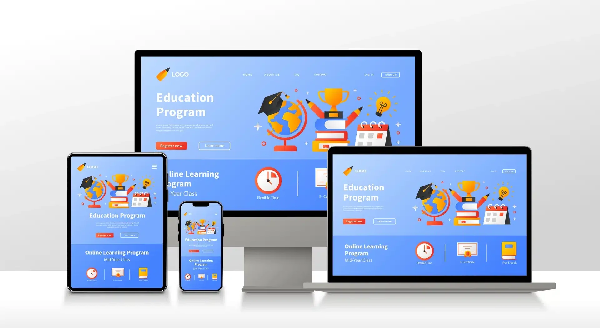
Responsive web design is a method where a website automatically adjusts its layout and elements to fit any screen size or device. In 2025, it’s essential because over 60% of web traffic comes from mobile devices. It ensures fast, easy navigation and better user experience, which drives more traffic, engagement, and conversions.
Google uses mobile-first indexing, meaning it primarily ranks websites based on their mobile version. Responsive sites score higher in search rankings because they provide better usability on all devices, improving organic visibility and attracting more qualified leads.
Responsive design leads to up to 11% higher conversions, 20% more engagement, and lower bounce rates. It also saves costs by eliminating the need for multiple site versions and future-proofs the website against new device formats like foldables and wearables.
While redesigning can be a project, many businesses successfully upgrade their current sites to responsive design. Modern frameworks and tools simplify implementation, and the long-term benefits in traffic and conversions outweigh the initial effort.
FirstFlynSoftware builds mobile-optimized, SEO-friendly websites with seamless UX across devices. We also provide analytics-driven optimization and future-proof design solutions to ensure your site drives leads, retains customers, and stays competitive in 2025 and beyond.
WhatsApp us